
Librarian Dashboard
Introduction
This document will go into detail about each chart on the dashboard, outlining what sort of data is being used, how the counts are being tallied, and filtering details. There are currently nine charts available for Library Staff, with four filtering options.
Filters
The Dashboard contains four filtering options which are available by selecting the "Filter icon" (see figure #1). The four filters available are Time Period, Course, School and Staff Member. Once a filter is selected it will be applied to the data for all applicable charts. For example, Library Staff can see the most used resources for a course/subject, most used licence for a given course/subject, how well a school/department is being serviced by a particular staff member etc.
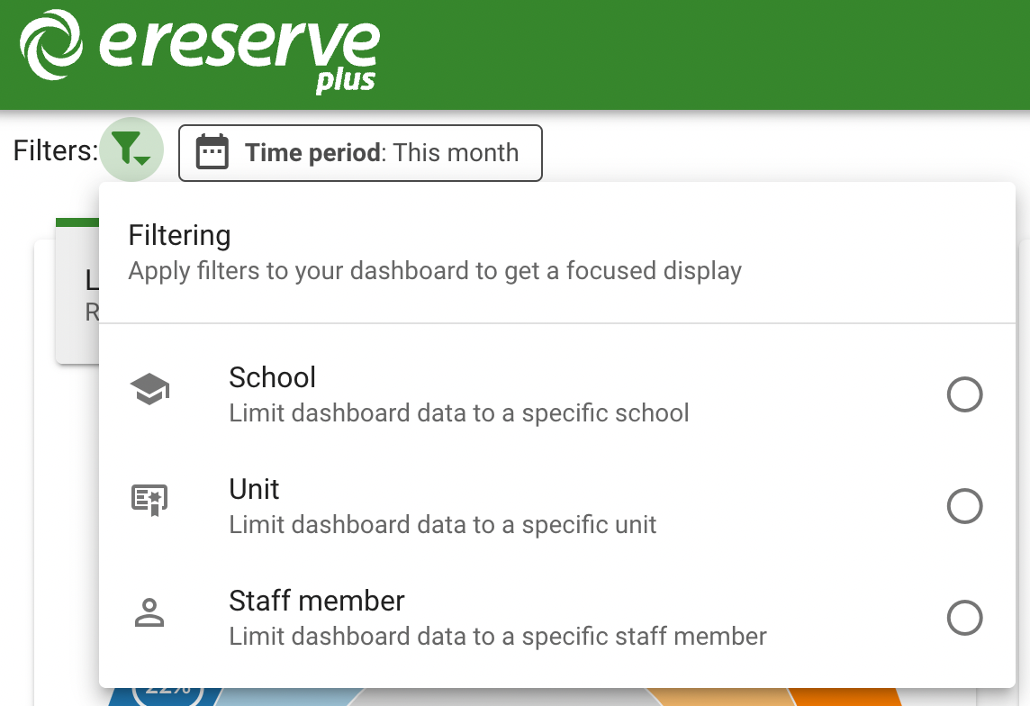
Each filter can be applied individually or in combination (I.E. Time Period, Courses and Staff Member can be selected to filter the Dashboard) allowing you to refine the dashboard display.
Time Period
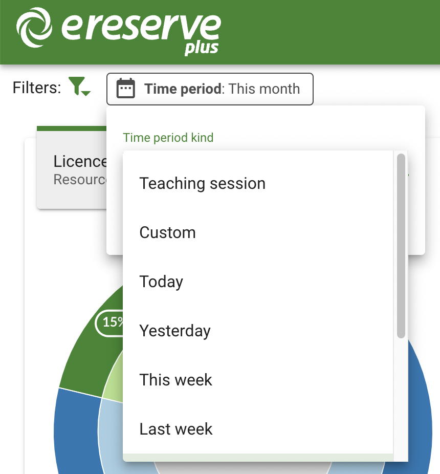
The Time Period filter is the preselected and default filter used for the dashboard. The Time Period filter can not be removed, however the date can be changed. There are a number of different options which can be selected from the Time Period drop-down and once a new time period has been selected, the dashboard will update accordingly.
The Time Period filter has the following options:
-
Teaching Session: presents a list of created Teaching Sessions within eReserve Plus, with additional selection options for:
- Reading Lists: only includes Reading Lists that use the selected Teaching Session
- Session Dates: use all records that fall within those Teaching Session dates
- Custom Duration: allows a selection of a Start and End date
- Predefined Time Periods: allows selection of a preconfigured time period
Course
The Course filter can be selected which will filter the dashboard down to a specified Course. Once selected, the Course filter button will appear in the list of selected filters. You can click the Course filter button to start entering in either a Course Code or Course Name to select the particular Course.

School
The School filter can be selected which will filter the dashboard down to a specified School/Department. Once selected, the School filter button will appear in the list of selected filters. You can click the School filter button to start entering in a School/Department name to select the particular School/Department.

Staff Member
The Staff Member filter can be selected which will filter the dashboard down to a specified Staff Member. Once selected, the Staff Member filter button will appear in the list of selected filters. You can click the Staff Member filter button to start entering in either the First or Last name of the Staff member.

Charts
Licence counts
The Licence counts chart provides a breakdown of requests within eReserve Plus by the licence or communication kind selected. The data presented by the Licence counts chart is based on the status of the requests. This chart only includes requests that have been processed (Active and Pending) and Removed.
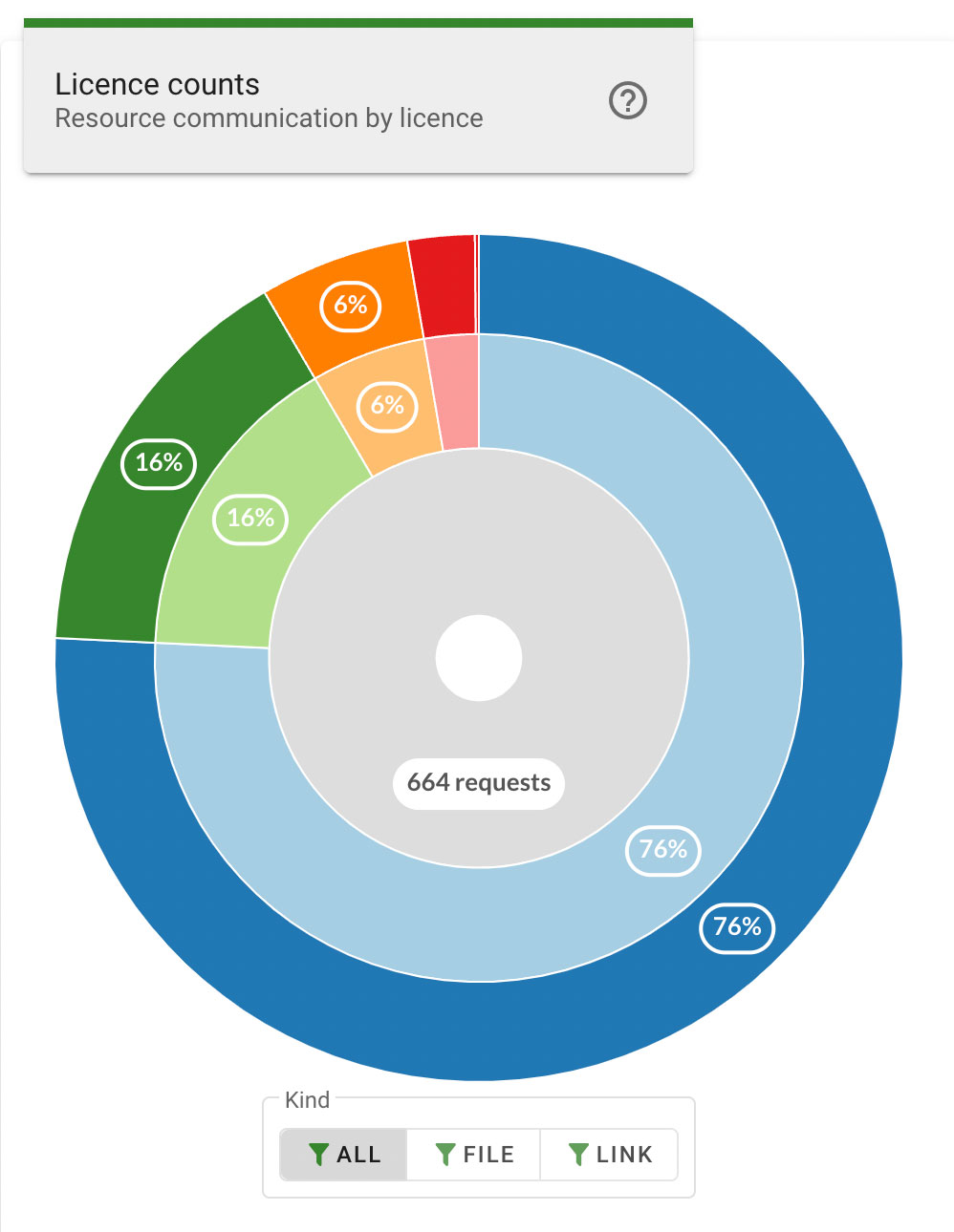
The rings of the chart are divided into segments that represent the portion of total requests that apply to each individual license type. Hovering the mouse cursor over a segment displays the specific counts for that individual license type, as well as the associated license groups using the individual license.
Each ring segment has an outer layer and an inner layer. The outer layer indicates the percentage of total requests using the individual license type, and the inner layer indicates the licence groups which provides counts of all requests using the individual licence within that group. Hovering the mouse cursor over either layer displays a popup that indicates the specific counts for each layer in the segment.
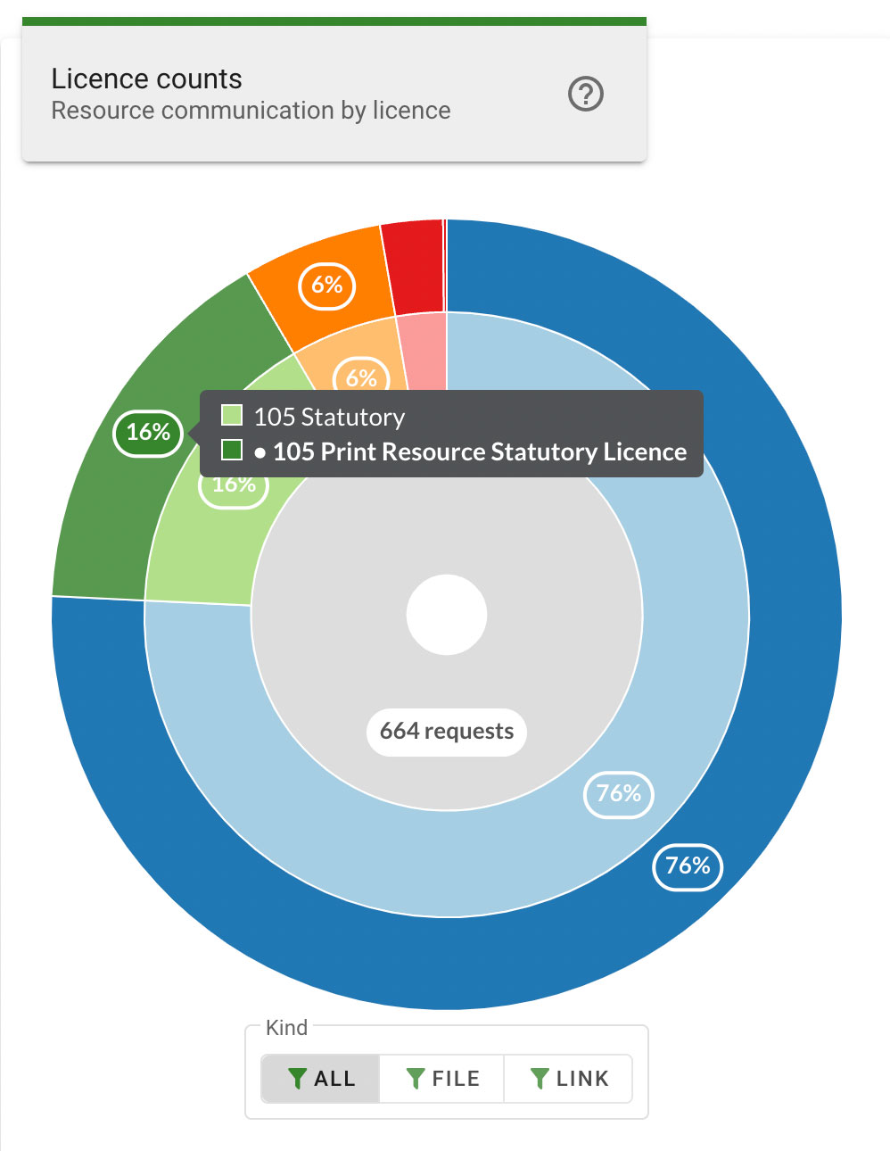
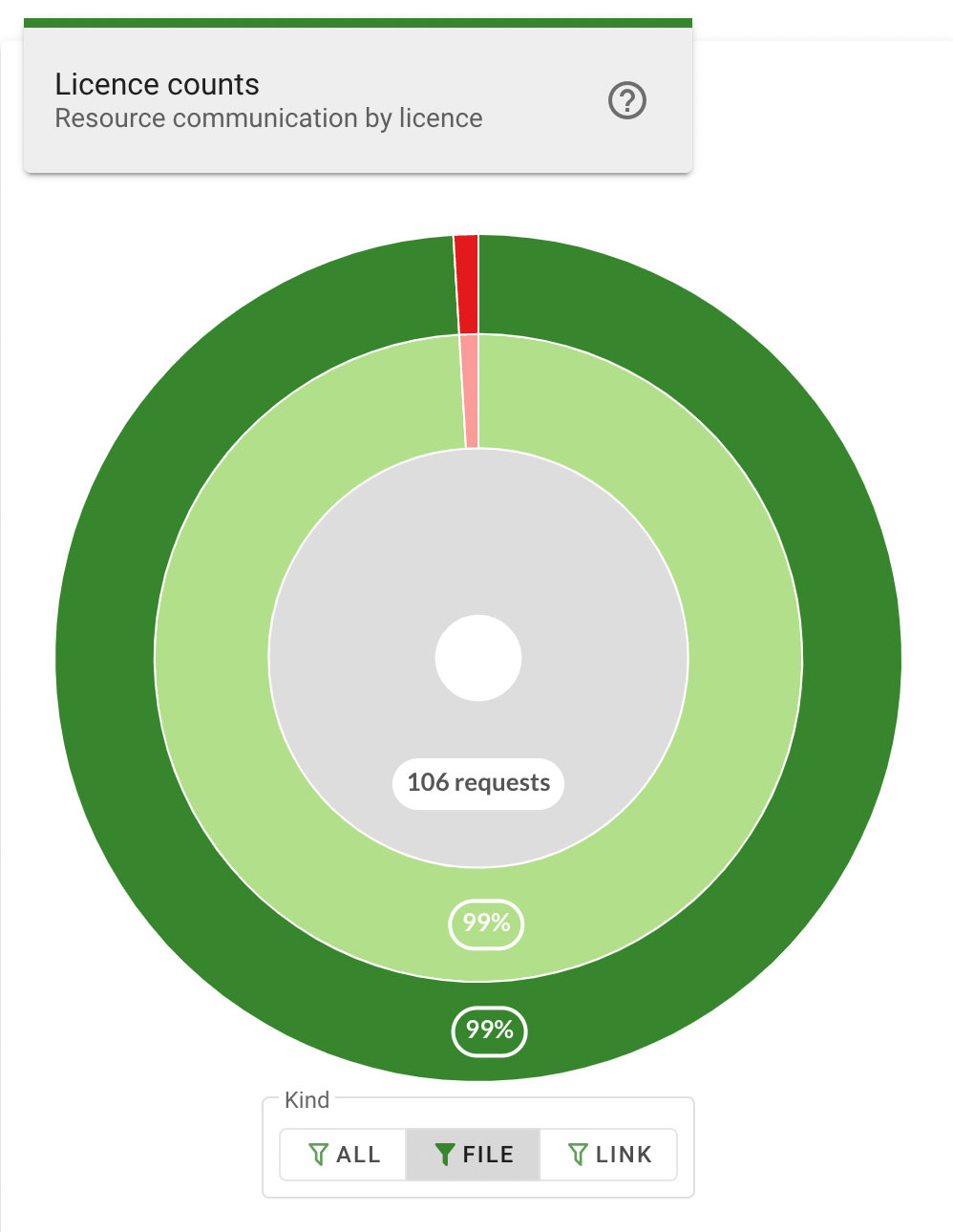
Each segment can be selected to focus the chart on a particular license type. Clicking the inner layer of a segment, or clicking the license type count on the segment popup, will zoom in to display only the layers for the selected segment in greater detail.
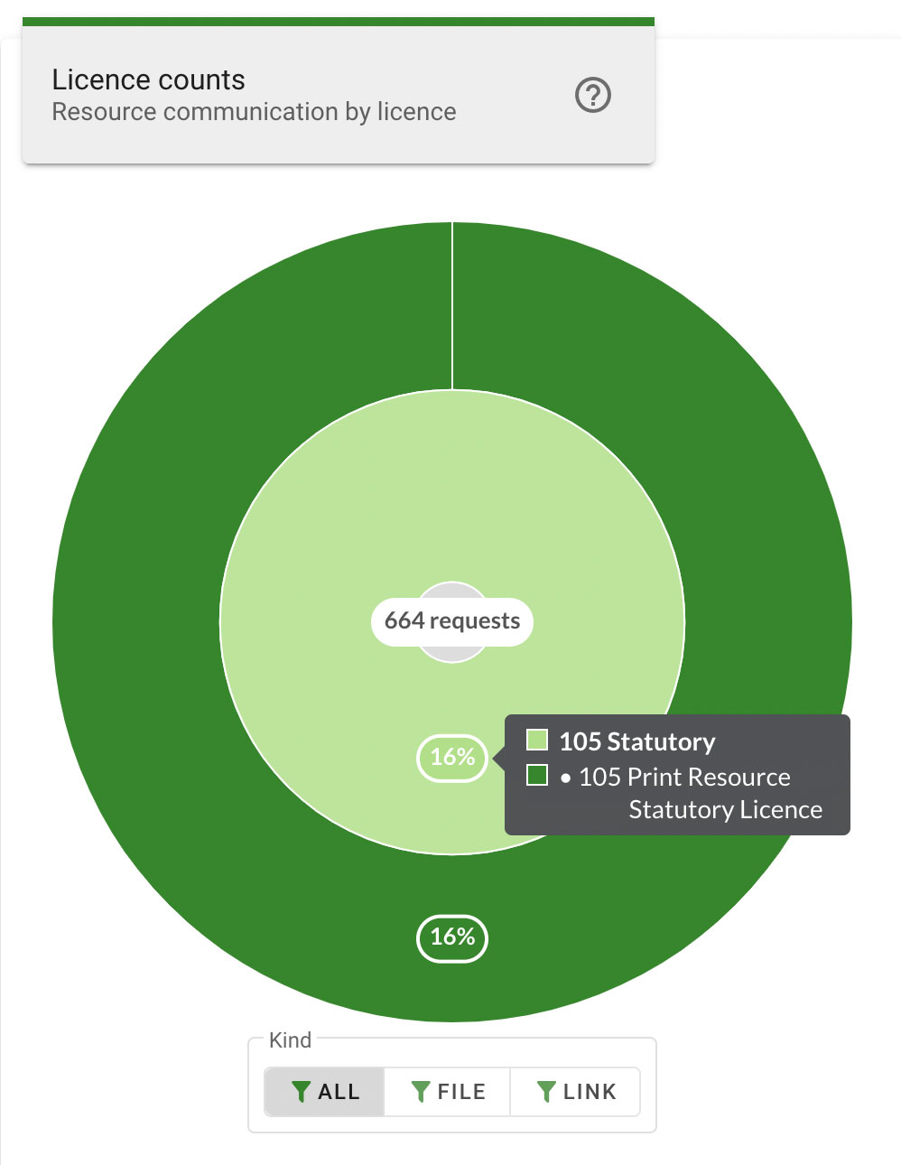
The center ring displays the total number of requests based on the chosen filters. Hovering the mouse cursor over the center ring displays a summary of the license types. Each license type can be clicked to focus and zoom in to display the selected segment.
Clicking on the center ring while focused on a segment, or clicking on All Requests on the center ring popup will, zoom out and return the chart to display all segments.
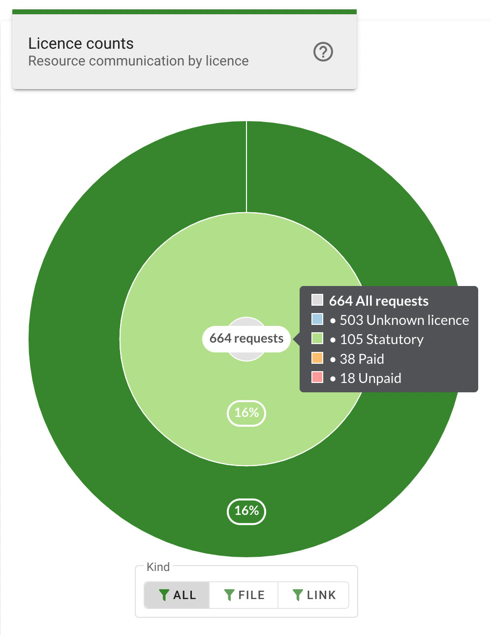
The license counts chart can be further filtered to only include specific resource kinds using the File and Link filters below the chart. Clicking a filter button will update the chart to display only requests of the specified resource kind. Clicking the All filter button will return the chart to display results including all resource kinds.
Required vs Recommended
The Required vs Recommended chart provides a breakdown of resources within eReserve Plus, showing how many resources are required and how many are recommended in each list, course, or school, which are represented by the layers of the chart.
The outer layer contains the reading lists and the percentage value indicates the portion of the total number of resources used in that list. Hovering the mouse cursor over a segment of the outer layer displays a popup that indicates the name of the reading list for that segment, as well as the total number of resources, and the number of Required or Recommended resources for that list.
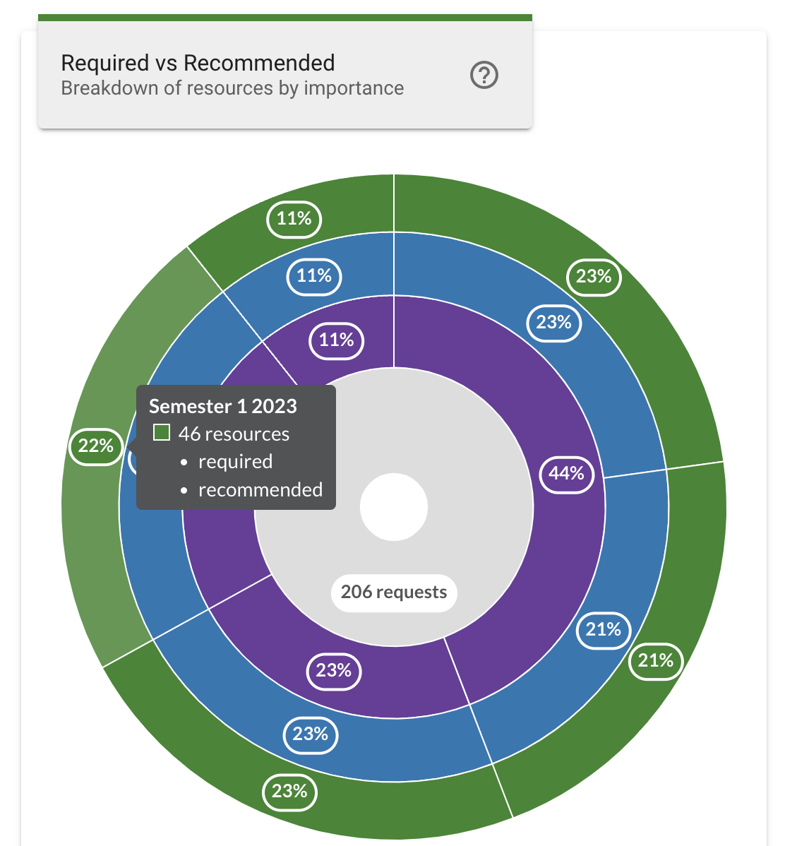
The middle layer contains the courses and the percentage value indicates the portion of the total number of resources used in that course. Hovering the mouse cursor over a segment of the middle layer displays a popup that indicates the name of the course for that segment, as well as the total number of resources, and the number of Required or Recommended resources included in the reading lists for that course.
Clicking on a middle layer will zoom in to display only the layers for the selected segment in greater detail, focusing the chart on just the selected course. This changes the outer ring to display percentage values based on just the selected course instead of the total resources.
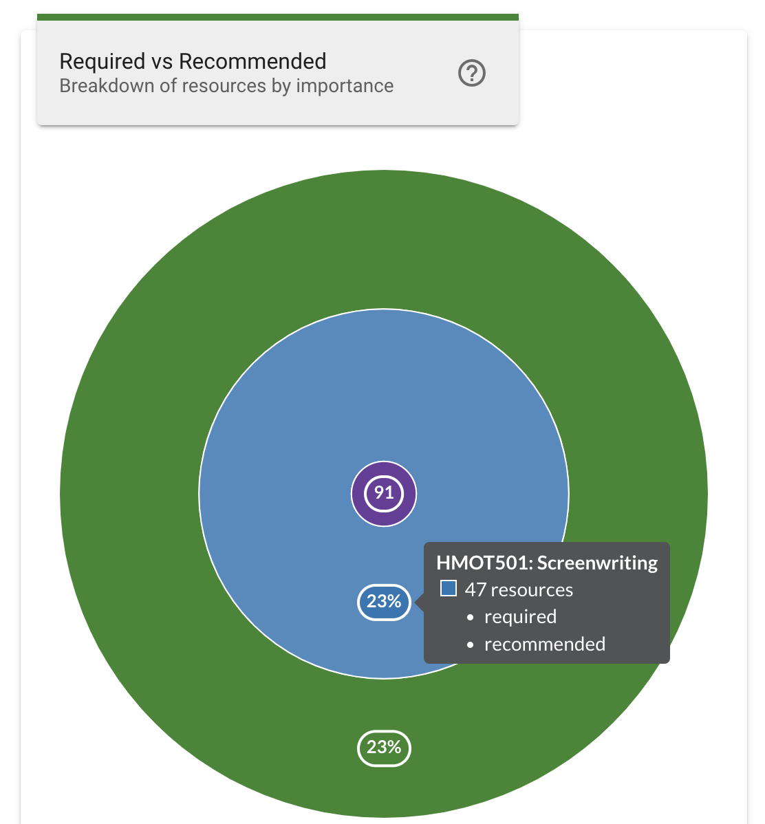
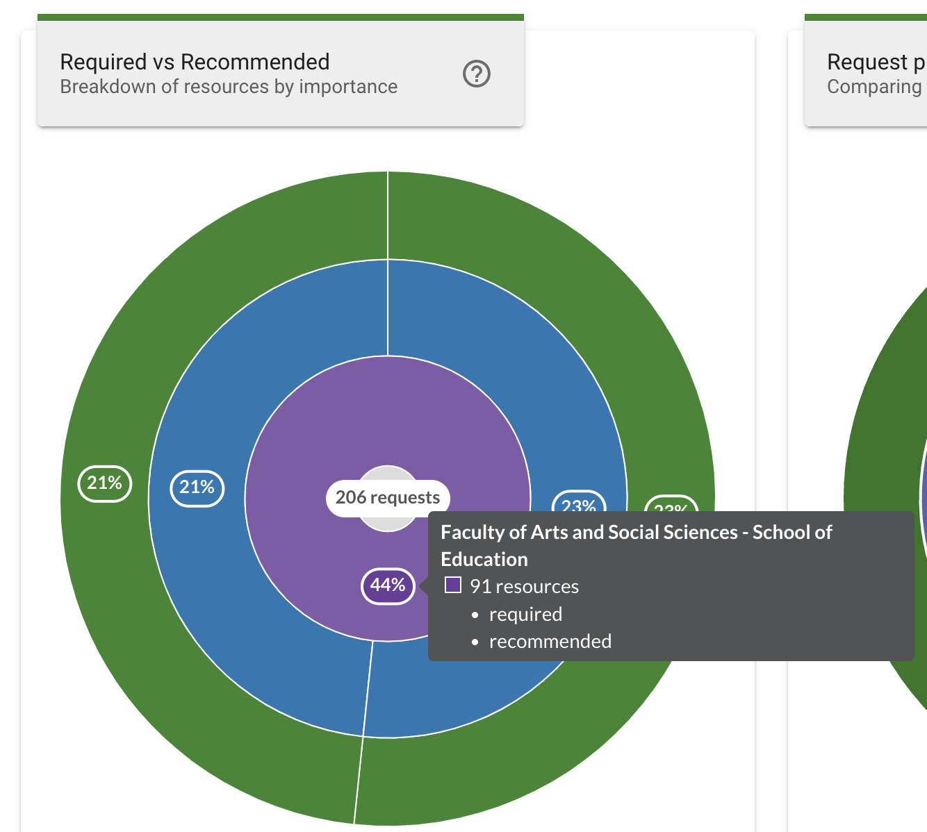
The inner layer contains the schools and the percentage value indicates the portion of the total number of resources used in that school. Hovering the mouse cursor over a segment of the inner layer displays a popup that indicates the name of the school for that segment, as well as the total number of resources, and the number of Required or Recommended resources included in the reading lists for that school.
Clicking on an inner layer will zoom in to display only the layers for the selected segment in greater detail, focusing the chart on just the selected school.
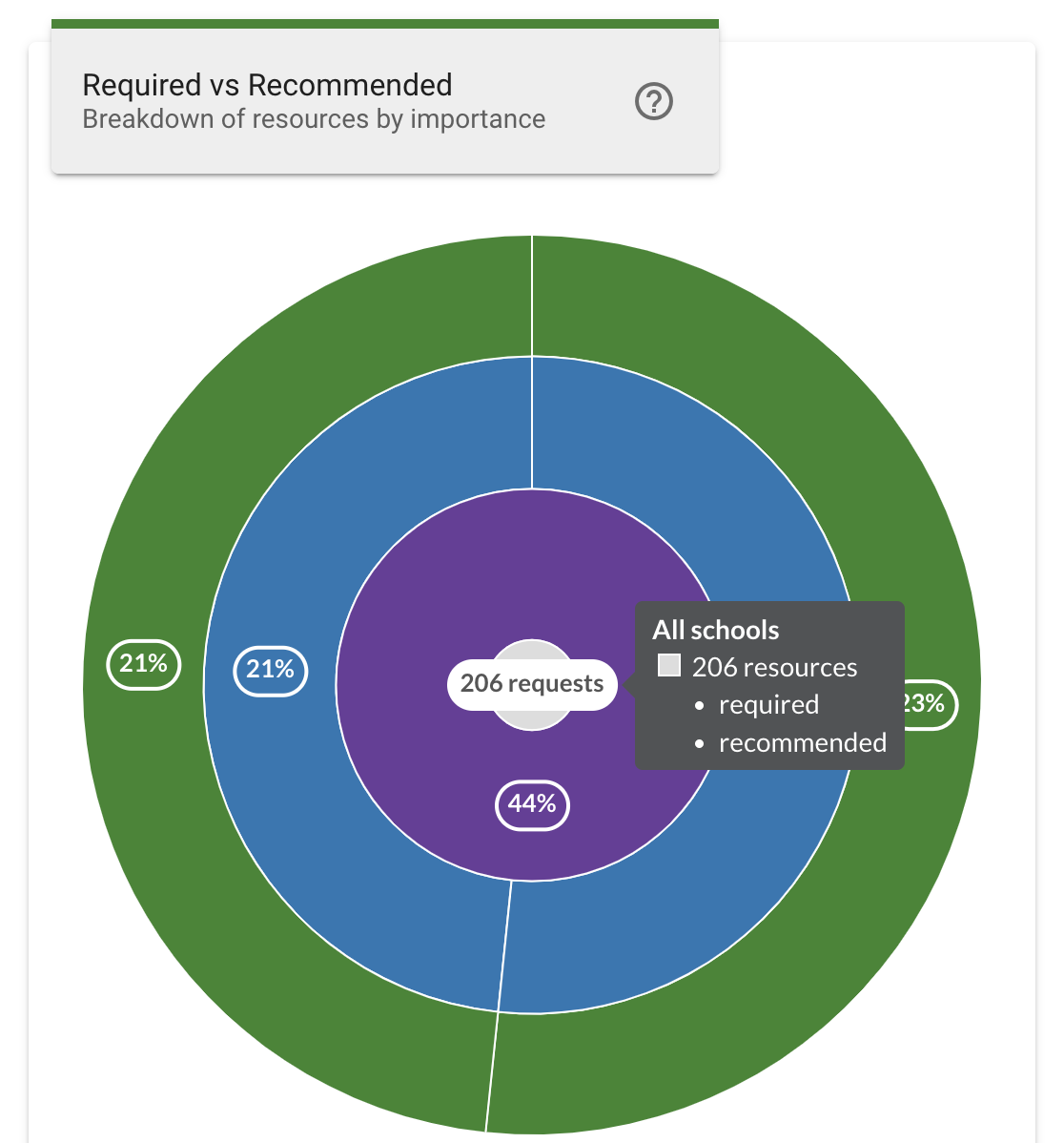
The center ring displays the total number of resources based on the chosen filters. Hovering the mouse cursor over the center ring displays the total number of resources, and the number of Required or Recommended resources for the chosen filters.
Clicking on the center ring while focused on a segment will zoom out and return the chart to displaying all segments.
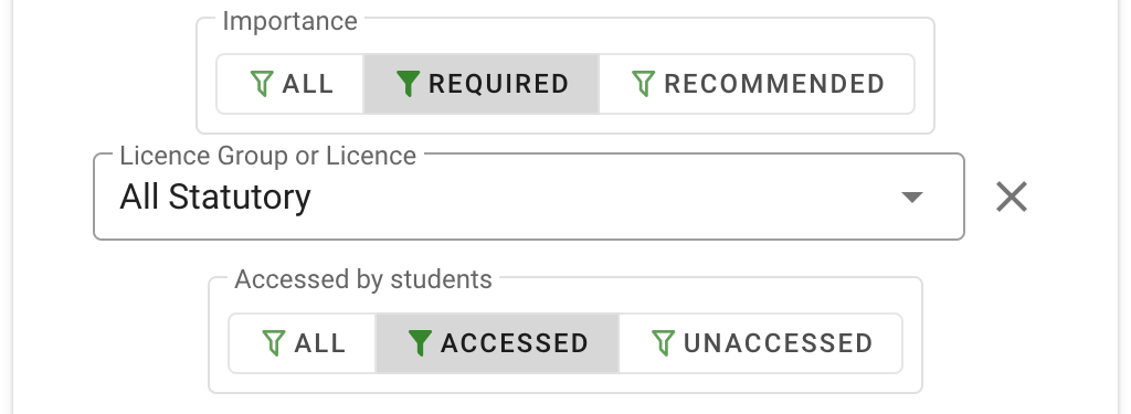
The required vs recommended chart can be further filtered to only include resources of a specified importance using the Required and Recommended filters below the chart. Clicking a filter button will update the chart to display only resources of the specified resource importance. Clicking the All filter button will return the chart to displaying results including all resource kinds.
The Licence Group or Licence filter updates the chart to only include resources of the specified licence type. Click the dropdown menu and select a licence group or licence type to filter the chart. Selecting All Licences from the top of the dropdown list will return the chart to displaying results including all licences.
The Accessed by students filter updates the chart to only include resources that students have engaged with, using the Accessed and Unaccessed filters below the chart. Clicking a filter button will update the chart to display only resources of the specified student engagement. Clicking the All filter button will return the chart to displaying results including all resource engagement kinds.
Requests Processing
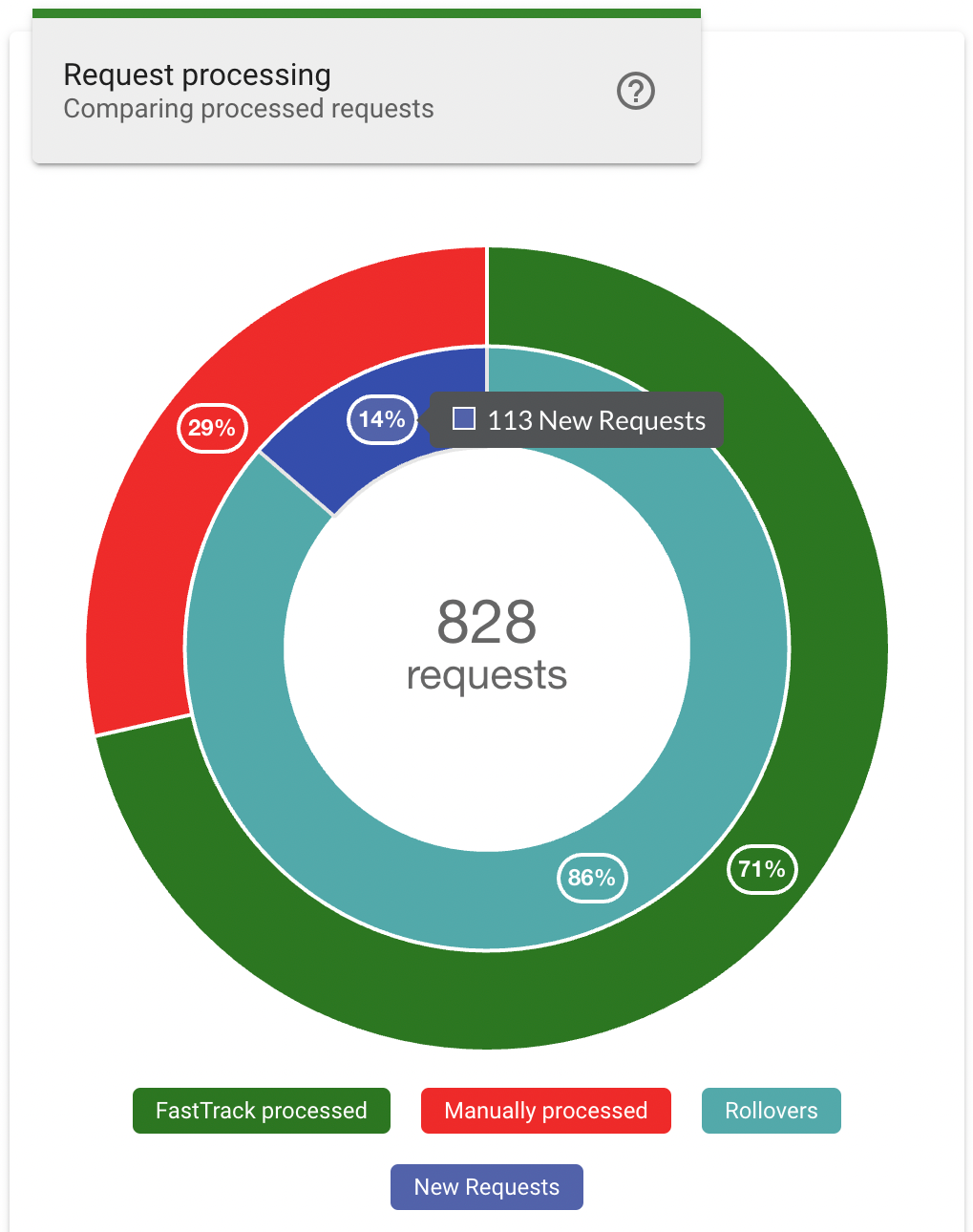
The Requests Processing chart provides a breakdown of the request, showing a comparison between new requests vs rollovers, and FastTrack vs manual processing.
The outer layer indicates the percentage of total requests that have been processed using FastTrack or processed Manually. The colour key below the chart indicates which portion of the layer is represented by each segment. Hovering the mouse cursor over a segment will also display the processing type and show the number of requests.
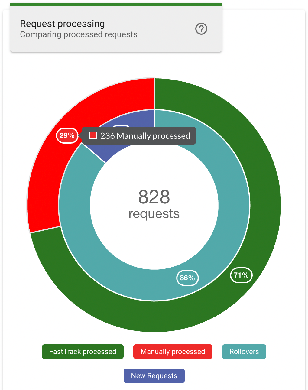
The inner layer indicates the percentage of total requests that are new or have been rolled over from a previous teaching session. The colour key below the chart indicates which portion of the layer is represented by each segment. Hovering the mouse cursor over a segment will also display the number of requests for the request type.
Processing Speed
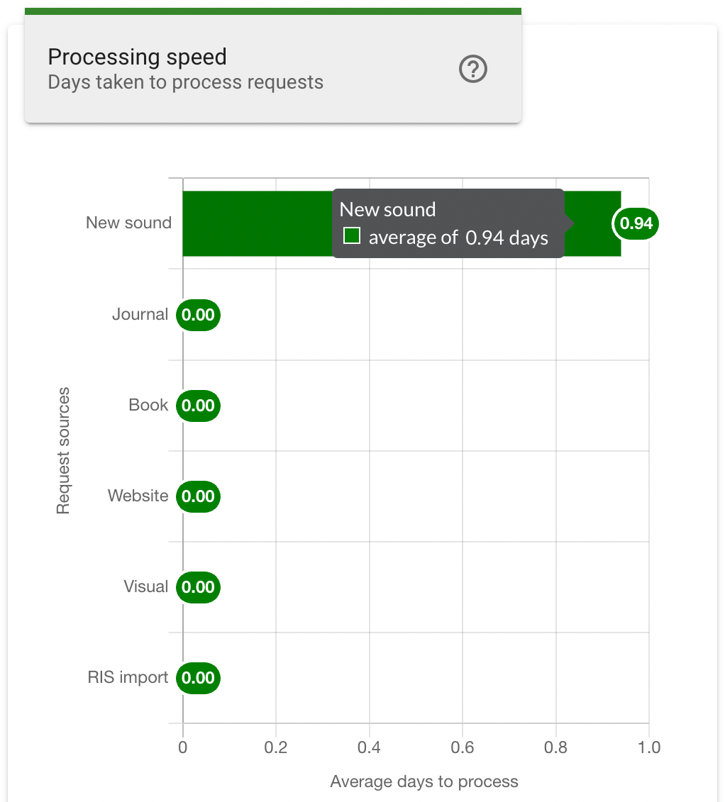
The Processing Speed chart provides a breakdown of the average time taken to process each resource type. The vertical axis indicates the resource sources, and the horizontal axis indicates the average number of days of processing time. Each bar includes an indicator at the end that indicates the average time for that resource type, additionally hovering the mouse cursor over a row will also display the average processing time and the status type.
The processing speed chart can be further filtered to only include resource sources of a specified kind using the Locate, File and Link filters below the chart. Clicking a filter button will update the chart to display only the request sources associated with the specified source kind. Clicking the All filter button will return the chart to display results including all source kinds.

Processing by Status
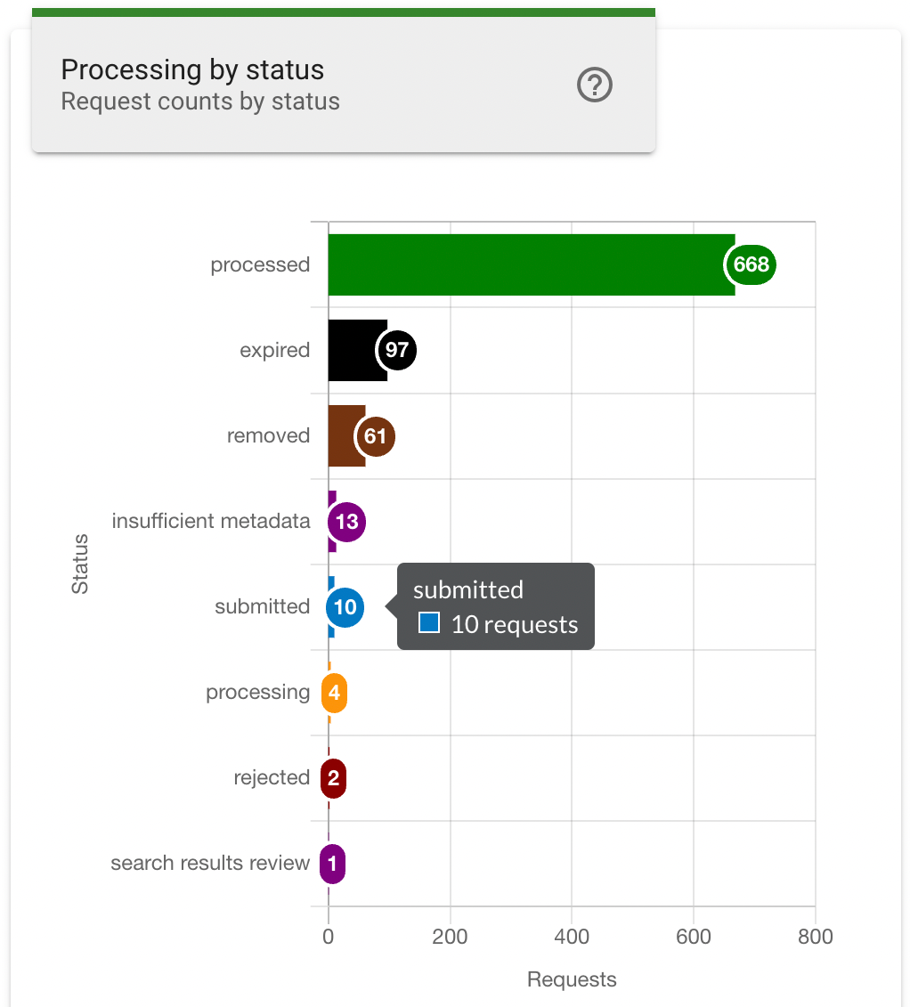
The Processing by Status chart provides a breakdown of the total processing request by their current status. The vertical axis indicates the request status types, and the horizontal axis indicates the number of requests. Each bar includes an indicator at the end that indicates the number of requests for that status type, additionally hovering the mouse cursor over a row will also display the number of requests and the status type.
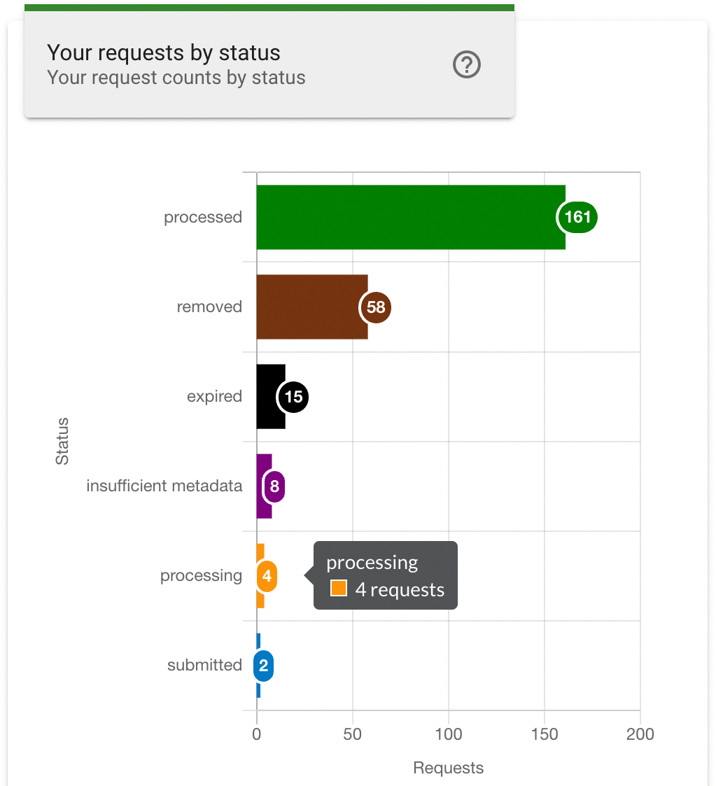
Your Requests by Status
The Your Requests by Status chart provides a breakdown of the requests that you are the reviewer for. The vertical axis indicates the request status types, and the horizontal axis indicates the number of requests. Each bar includes an indicator at the end that indicates the number of requests for that status type, additionally hovering the mouse cursor over a row will also display the number of requests and the status type.
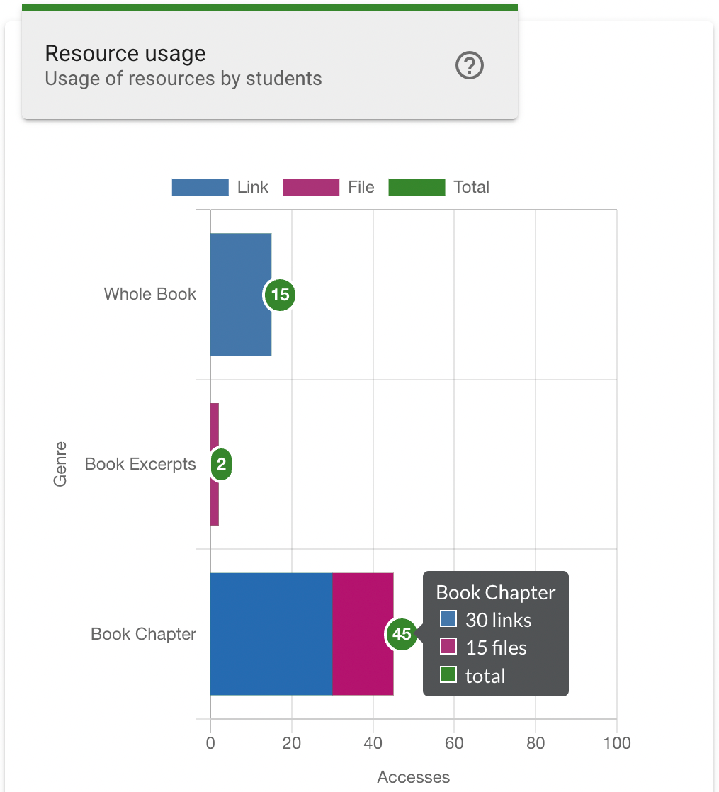
Resource Usage
The Resource Usage chart provides a breakdown of the resource genres and the number of accesses. The vertical axis indicates the resource genres for the selected resource type, which is controlled by the Resource Type filter buttons below the chart. The horizontal axis indicates the number of accesses for the selected Metric, which is controlled by the Metric filter buttons below the chart. A colour key is shown at the top of the chart, indicating the portion of the resource genre accesses that correspond to file or link access, as well as the total number at the end of the bar. Hovering the mouse cursor over a row will also display the number of file or link accesses and the resource genre.
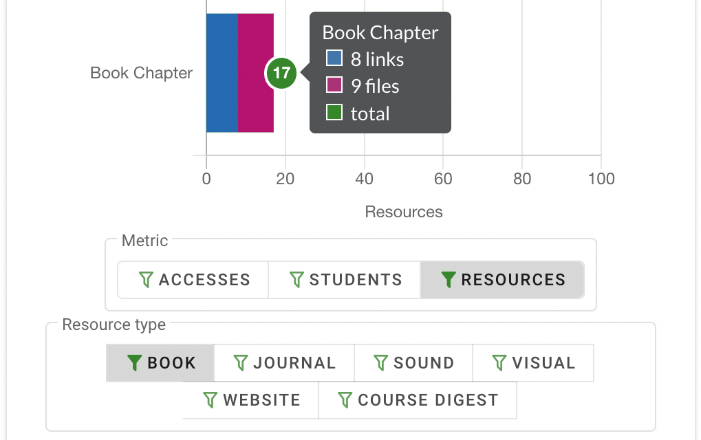
The Metric filter changes the usage count data to one of three options:
- Accesses: The total number of times a file or link was accessed by all students for the genre.
- Students: The number of individual students that have accessed a file or link for the genre.
- Resources: The number of file or link resources for the genre.
Clicking a Resource Type filter button will change the chart to display a set of resource genres associated with the selected resource type.
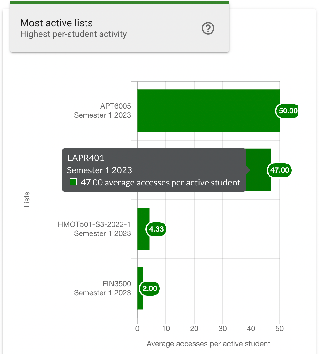
Most Active Lists
The Most Active Lists chart show the reading lists with the highest student engagement. The vertical axis indicates the course name and reading list name, and the horizontal axis indicates the average number of accesses per active student.
Each bar includes an indicator at the end that indicates the average number of accesses for that reading list, additionally hovering the mouse cursor over a row will also display the average number of accesses, and the reading list name.
Most Accessed Resources
The Most Accessed Resources chart shows a list of resources with the highest student accesses. The vertical axis indicates the ranking (most accesses to least), and the horizontal axis indicates the number of unique students that have accessed each listed resource.
Each bar indicates the total unique student accesses, and hovering the mouse cursor over a row will display the publication title, resource title and unique student accesses.
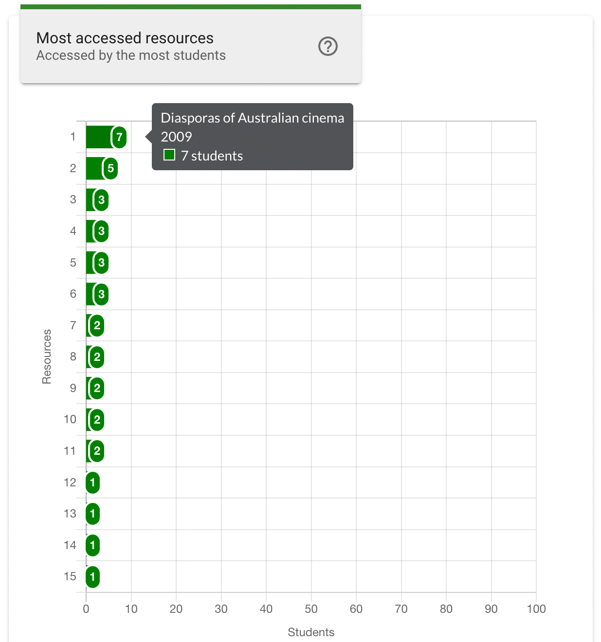
The chart can be further filtered to only include most accessed resources of a specified kind using the File and Link filters below the chart. Clicking a filter button will update the chart to display only the most accessed resources for the specified resource kind. Clicking the All filter button will return the chart to display results including all resource kinds.
